Parsewise UI library
The component library
A skill interface is assembled from ready-made blocks. Cards, switches, galleries and forms — right inside the chat. Every block is a data attribute: mark it up in drawer.html and the widget assembles the component itself.
Components
cards, selection, input, media
Events
on the drawer host
Lines of CSS
only Tailwind and data attributes
Observer
MutationObserver catches dynamic markup
Components out of the box
Mark it up and the widget assembles it. Components are declared with data attributes and processed through a MutationObserver: they work in static markup and when created from JS. User events arrive on the drawer host.
Cards
Vertical with a photo on top, or horizontal in the app-store style: a heading, text and a round or rounded icon.
Radio switch
A pill with an animated marker across N options. Disabled with the radio-switch--disabled class.
Selection grid
Clickable cells in two or three columns: a label, a value and a caption. One active at a time.
Selection list

Rows with a heading and a description — for mutually exclusive options in a single column.
Autosuggest
A field with dropdown suggestions through the backend suggest proxy. The list sits in the flow and pushes the content down.
Input and table

Ready-made input classes and a Tailwind results grid — the gap creates the visual separators.
Emoji rating

Three animated faces — poor, fine, great. For quick feedback and reviews.
Action buttons

A link with an automatic brand icon (Telegram, WhatsApp, a call) or a callback with an icon from the Heroicons set.
Gallery

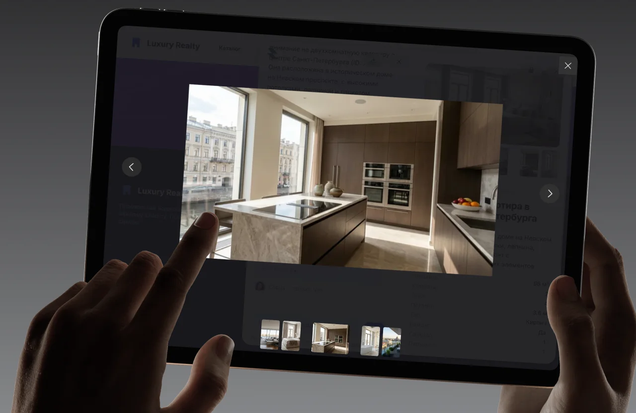
A grid of previews with a Fancybox lightbox. Links are direct or through the bundle assets {{asset:…}}.
Detail list
A summary card: “label → value” rows with separators. For confirming a request before it is sent.
File upload

A dropzone for photos and video that uploads to object storage over a presigned URL.
Aligned across the system
The styles are isolated in the Shadow DOM. You write only Tailwind, the brand colour arrives through the skill-primary utilities, and the heights of fields and switches are already tuned to match each other.
skill-primary utilities
text, bg, ring, border, fill
Control height
input and selection are aligned
Asset limit
PNG, JPG, WebP, SVG, GIF
Files in a bundle
uploaded to storage automatically
Two routes to a skill
The visual creator is the no-code route. And the components plus the .skill format are a ready specification for a model: hand it to an LLM and it assembles an interactive skill for the task.
-poster.webp&w=2048&q=75)


Components at work
The ready-made skills are built from the same blocks. A quiz, an enricher, a calculator, a feedback form — each takes its components from the library and runs right inside the chat.
Skills live in a sandbox
Developer questions
With a data attribute in drawer.html: <div data-radio-switch data-options="…">. The widget processes it through a MutationObserver — it works both in static markup and when created from JS.
Build your own skill
From the file to the call. The library, the .skill format and the skill creator are available on the free plan — no card required.
Markup
Assemble the drawer from data components — in the creator or by hand.
/02Manifest
SKILL.md with the triggers and the instruction for the model — next to the code.
/03Upload
The .skill file goes to the admin panel, the assets to storage, and the JS is validated.
/04Call
The router finds the skill by meaning and the model opens it itself.
Test it on your own data
Upload your own documents and catalogue — then ask the assistant the questions people ask you. That is the only test that means anything.